Who is Oz and what’s his story?
Oz started as an engineer in India but found coding without a soul about as satisfying as a soggy burrito. A psych class flipped the switch, leading to a degree in computer science and an obsession with Human-Computer Interaction (HCI). From AR apps to game interactions, Spain became the perfect spot for a master’s in Interaction Design (and better tapas). Since then, he’s built brand installations and spent six years in medical tech, turning complex systems into intuitive experiences.
Why Oz, when there are 10,000 other designers out there?
Oz doesn’t just make things pretty; he builds UX that works harder than a caffeine-fueled intern. From motion-driven interactions to prototypes that catch problems before they exist, he makes the impossible look easy. His secret weapon? Blending design with nature’s best tricks (shoutout to biomimicry) and using systems thinking to make everything click. Others hand you a shiny UI; Oz makes sure it works. No head-scratching required.
How does Oz tackle projects without losing his mind?
Oz tackles projects like a science experiment, minus the lab coat. Every project follows four phases: Discovery, Concepting, Prototyping, and Refinement. He maps ecosystems, interviews stakeholders, and locks down user needs before diving into rigorous testing. What sets him apart? Collaboration isn’t a checkbox; it’s the core. Feedback isn’t a hurdle; it’s fuel. Design isn’t solo; it’s a team sport, and Oz plays to win.
*Disclaimer
All written by me, in the third person, because the alternative was a paragraph starting with “I am passionate about design”.
0→1 Product Design
Design Systems at Scale
Product Strategy
Design Leadership
Collective
Minds
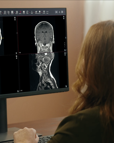
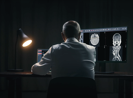
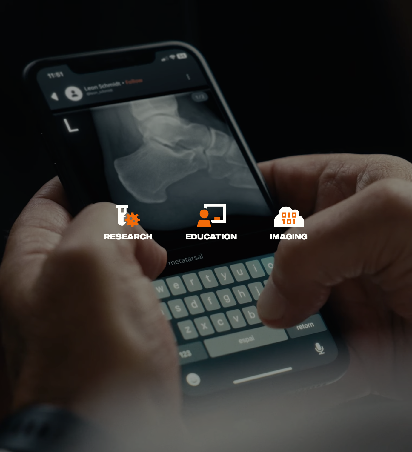
Hands holding a phone showing a dark chat interface with an on-screen keyboardA woman reviewing a medical scan on a desktop monitorA man working at a desk lit by a single lamp in a dark room
Barcelona, Spain
A greenfield product in one of the world's most regulated industries.
No flows. No research. No designer who'd ever spoken to a single user. I joined to change that. Five years later I shape product vision across three products, run the design system that powers all of them, and built the team that carries it forward. Here's how that happened, and the decisions behind it.
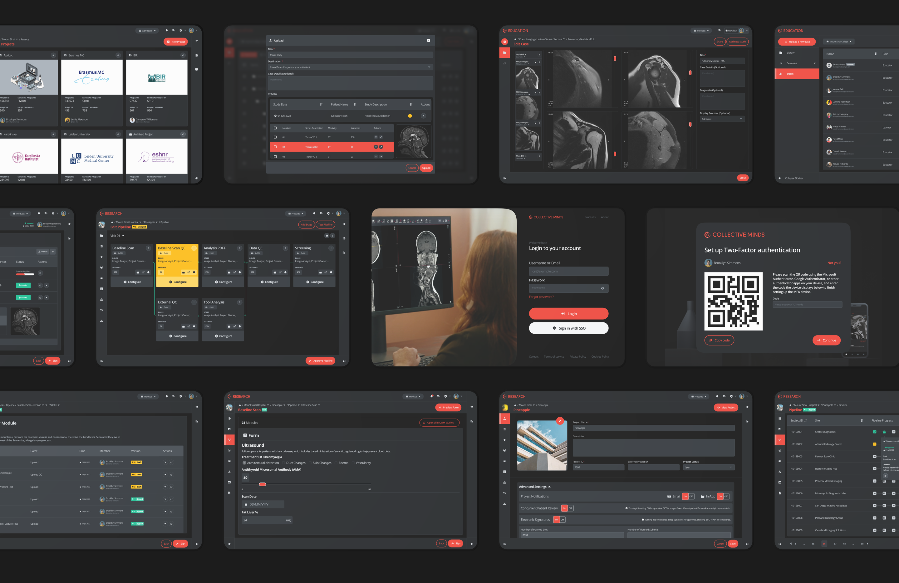
A grid of dark interface screens from the clinical trials platform
Day One
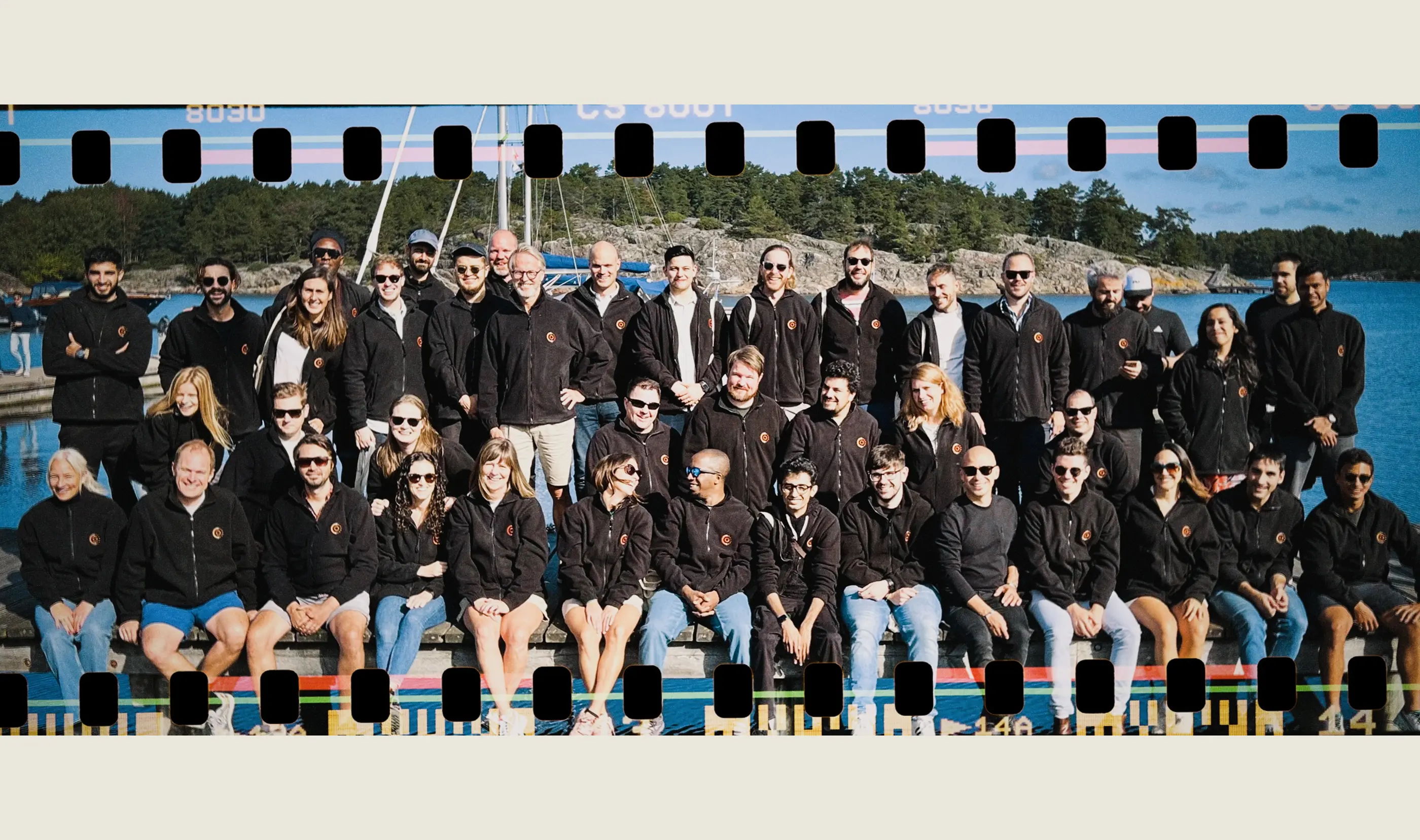
When I joined Collective Minds in January 2021 there were twenty-five people across two offices.

The company had a radiology collaboration platform that worked. Clinicians discussing cases with full DICOM data. Built by an external agency. That was paying the bills. But the real bet was a clinical-trials platform, something that could run pharmaceutical research at scale, and for that they had nothing.

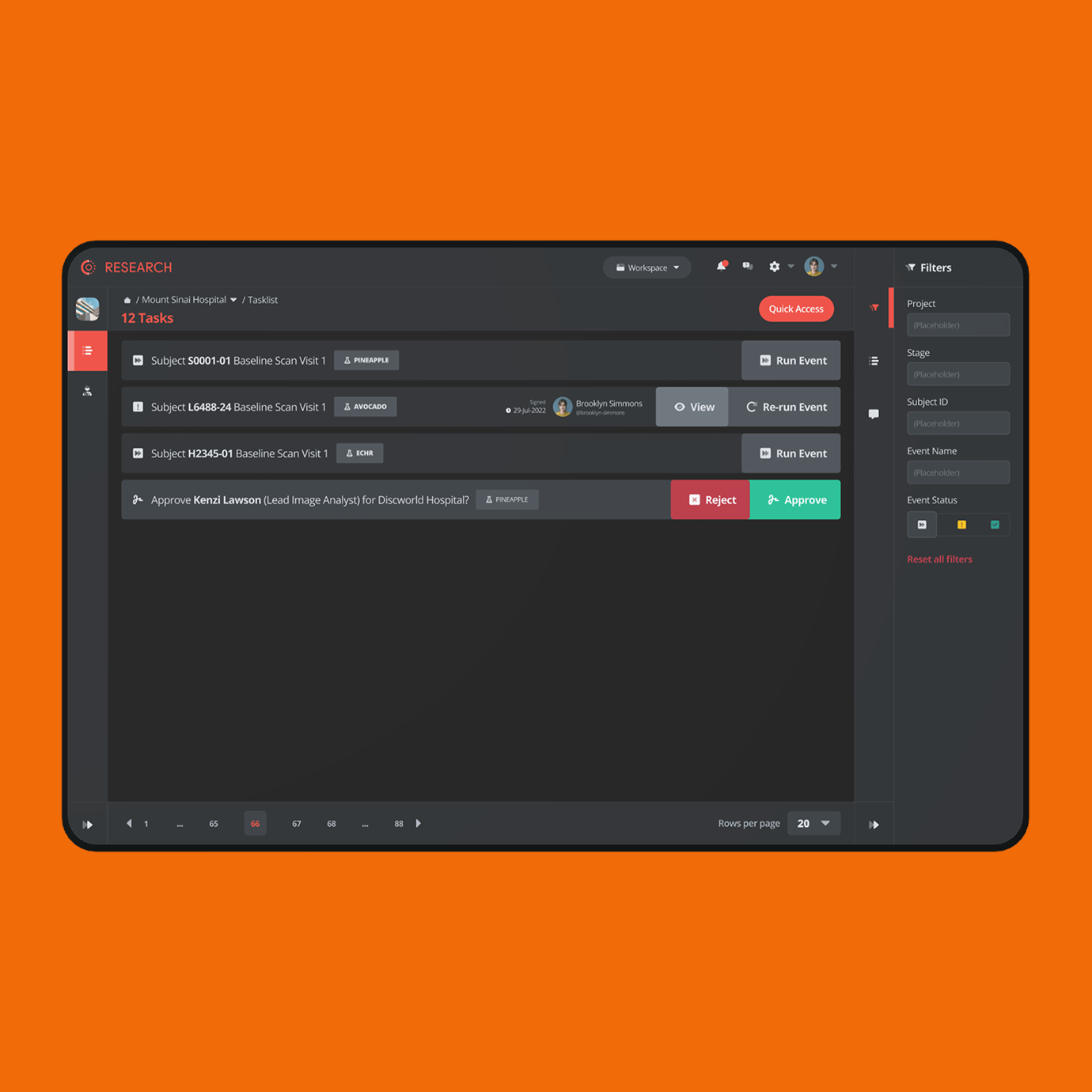
They hired me to change that. The brief was simple: go to the labs, talk to the people, build something real. What nobody mentioned was that I'd be doing all of it alone. Two years as the only designer in the building. Every decision mine to make, every mistake mine to own.
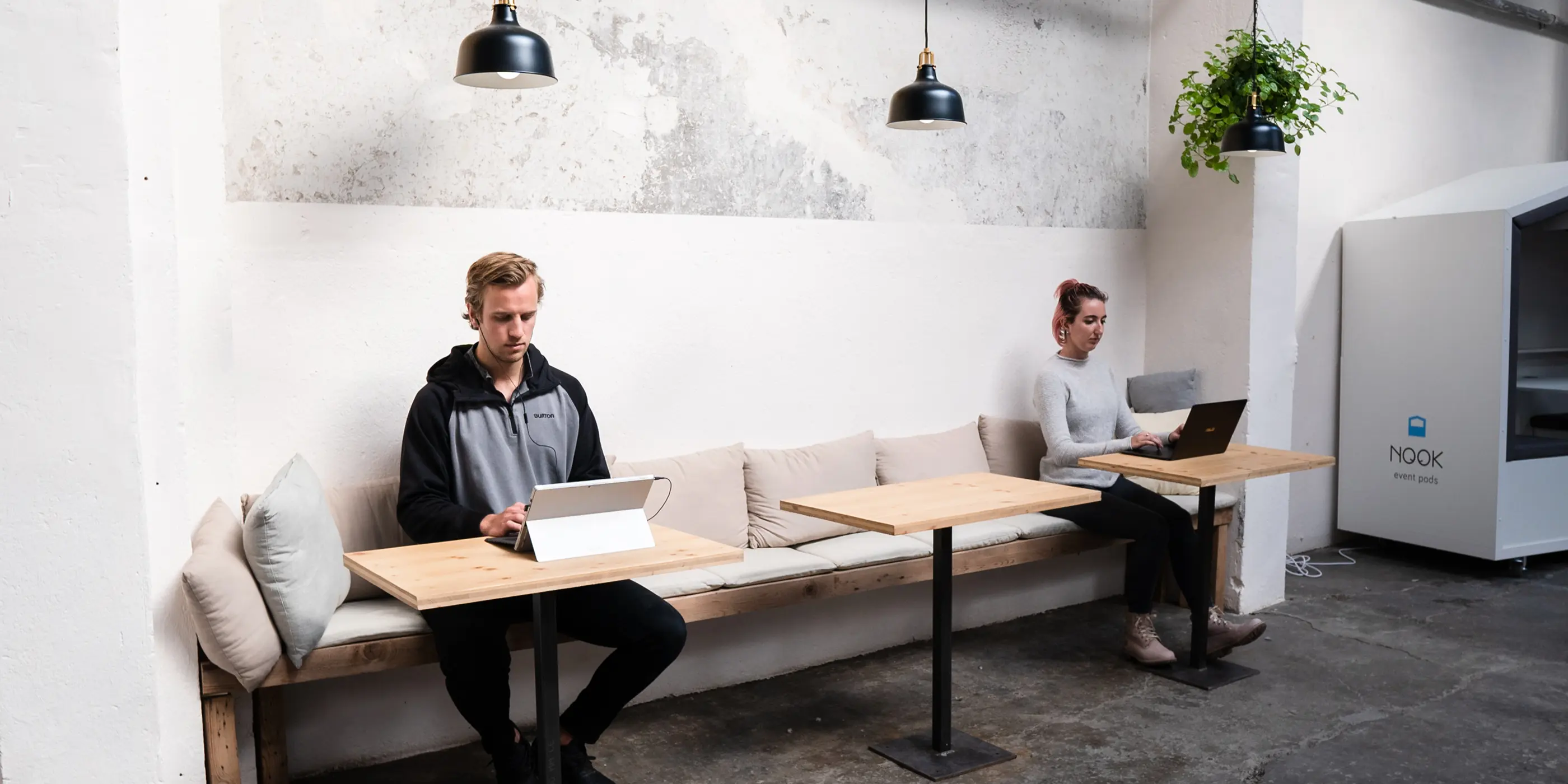
A colleague working on a laptop from a sofa in the office lounge
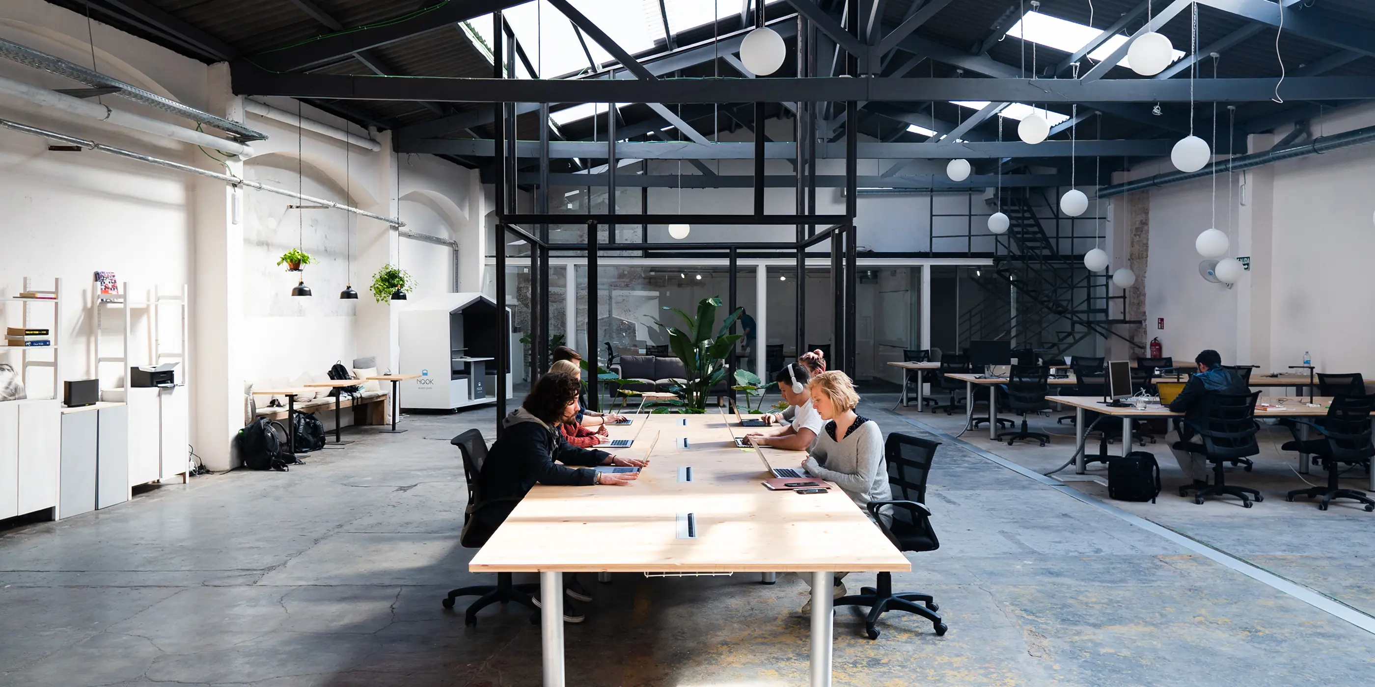
Colleagues working at long desks in a bright open office
An open plan office with high ceilings and exposed beams
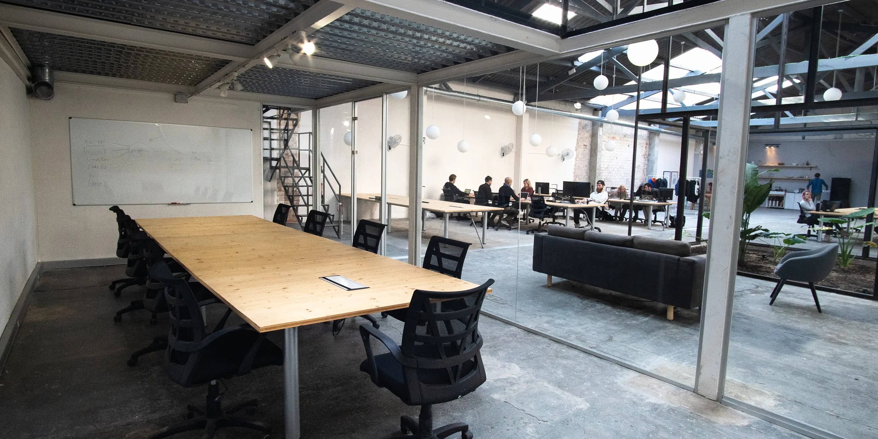
An empty meeting area with long shared tables
Sweden
To begin my research, I flew to Sweden.

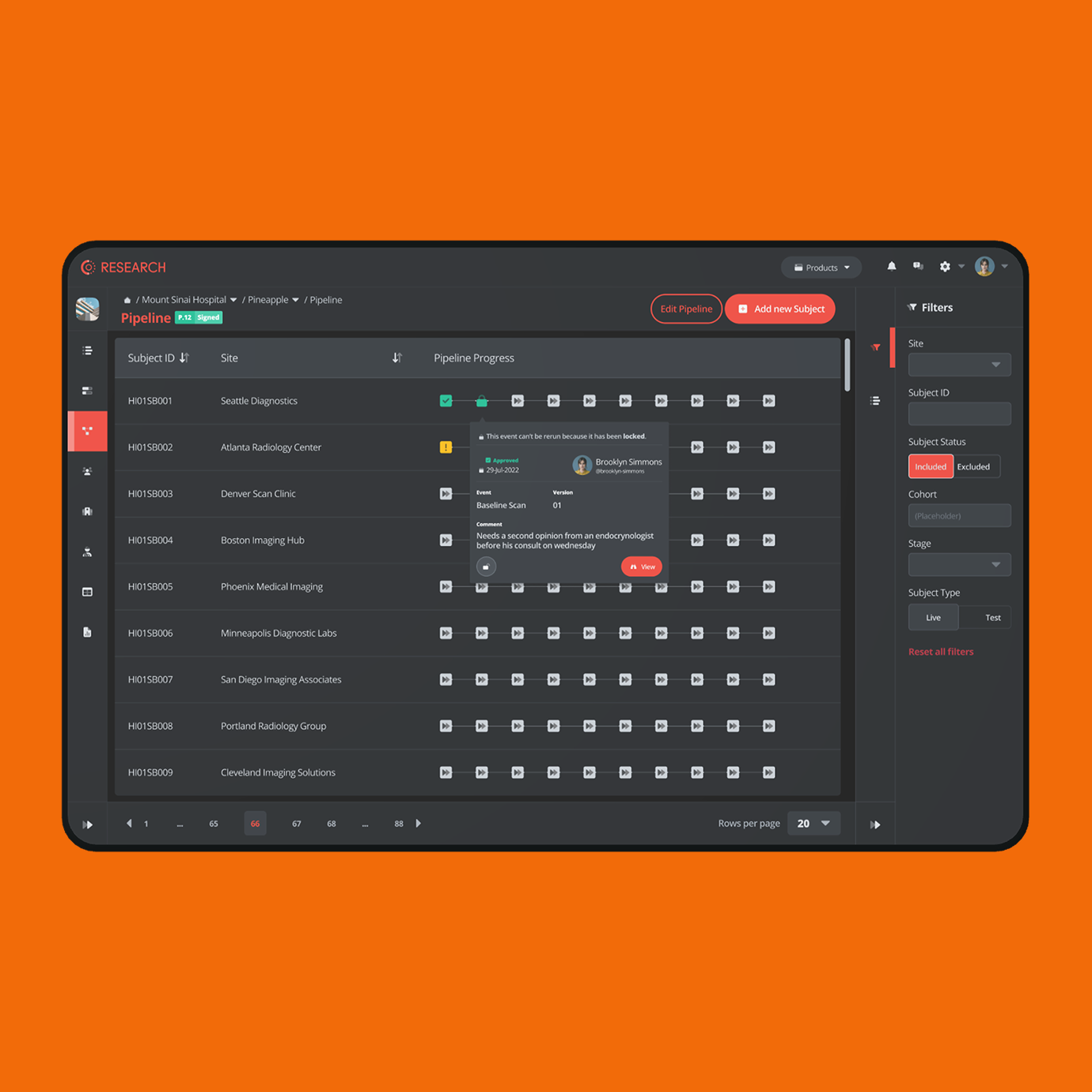
The lab I visited there was a CRO, developing drugs for big pharma. Weekly calls and on-site visits, sustained over years, not a one-week discovery sprint with a readout deck at the end. What I found was an industry running on paper forms, manual measurements, and a generous supply of human error, all of it eventually exported into Excel sheets so wide nobody could read them. Where digital systems existed, they were badly built, and none of them spoke to each other.
Yellow sticky notes clustered on a whiteboard during a workshopA long shared table with the team working along both sides
The goal was never to digitise the mess. It was to make it disappear.
Every Trial Is a Pipeline
The breakthrough wasn't a feature. It was a model.

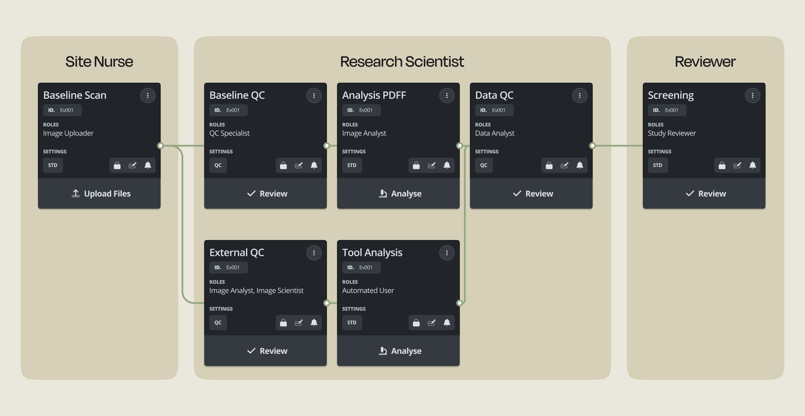
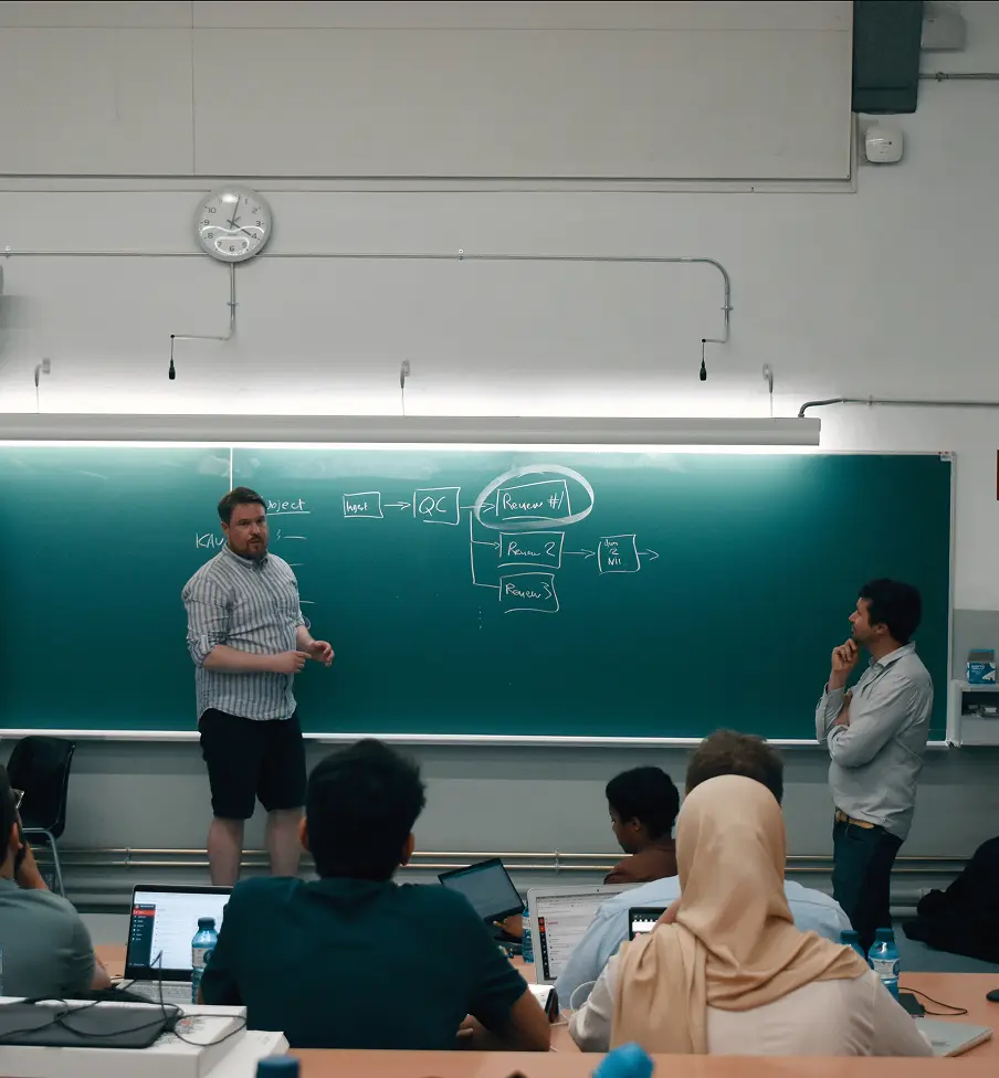
Every research project followed a workflow, a pipeline. Break those pipelines into customisable, permissioned pieces and a hospital anywhere in the world could run the same trial on the same interface, while the data stayed traceable and clean.

A site nurse, a research scientist, and a trial sponsor would all open the same platform and see completely different products. Only the data and the actions their role needed. Nothing else.
A workflow diagram splitting the review process across site nurse, research scientist and reviewer roles
Permissions
I didn't design role-based permissions because a requirements doc asked for them. I designed them because talking to users made two things obvious: every role needed the system to behave differently, and data leakage was the single biggest failure of every system they'd used before.

Scoping each role to exactly what it needed solved both at once. It killed the leak risk and stripped each interface down to what the person actually uses.
One decision closed the security hole and simplified the interface. The best ones usually do both.
A dark data entry screen from the platform, shown on an orange backgroundA dark table view from the platform with status labels, shown on an orange background
What Didn't Ship
Plenty of features were dreamed up from stakeholder expectations and then died the moment they met a real user in testing. Cutting them was the job, not a detour from it.

CM-Research became the platform that grew the company. I've kept the weekly calls with the Sweden team running for years, not as a courtesy, but because every decision still needs to be anchored to a real workflow instead of a whiteboard.
A wrong feature is cheapest to kill before it's live. Most expensive once a regulated customer depends on it.
Education
It started as an internal tool to train site nurses. Then the market told us what it actually was.

While selling CM-Research, the same signal kept surfacing: our research users needed training, and the market for it was large. Today that little internal tool runs entire university semesters.
Hands annotating a document on a tablet at a desk
It started as internal training. The market told us it was a product.
Slides Don't Work When the Subject Is a Scan
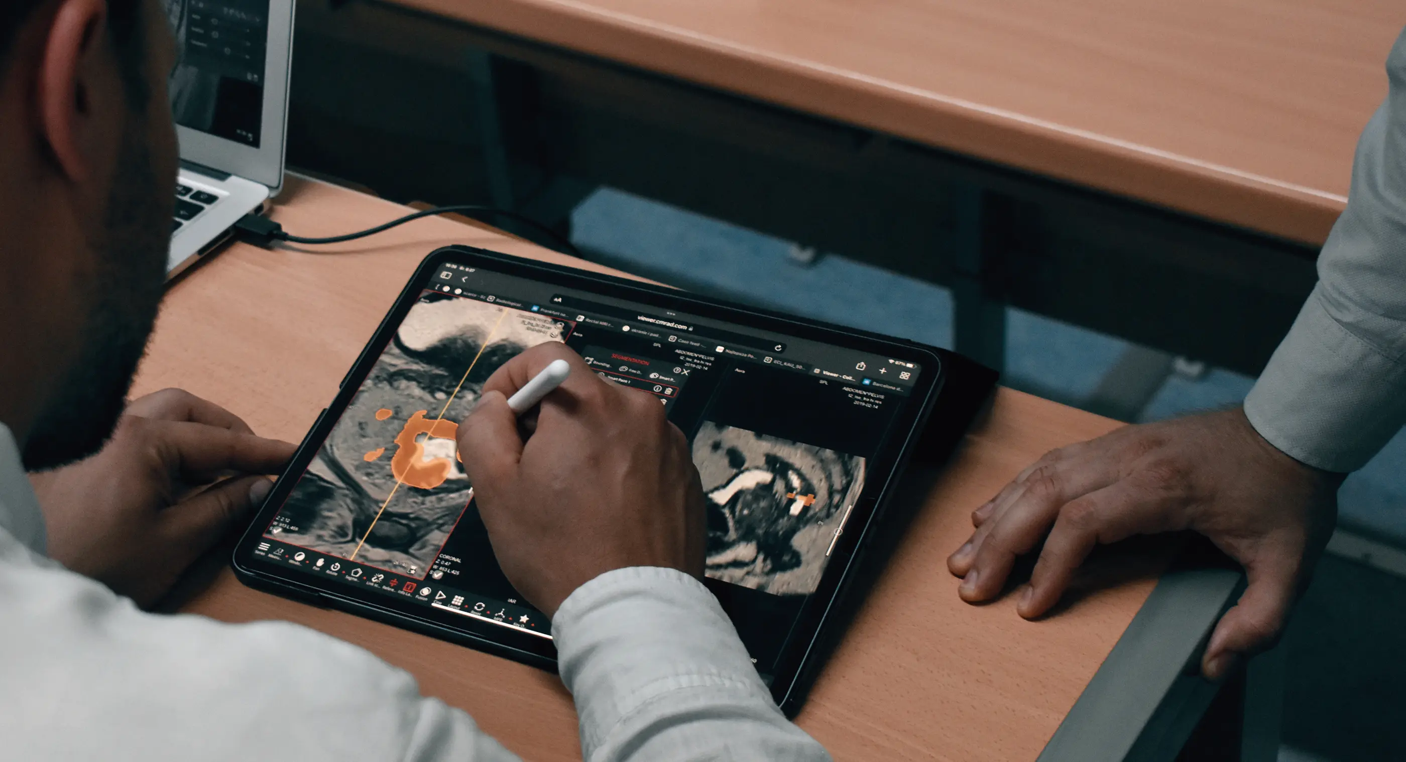
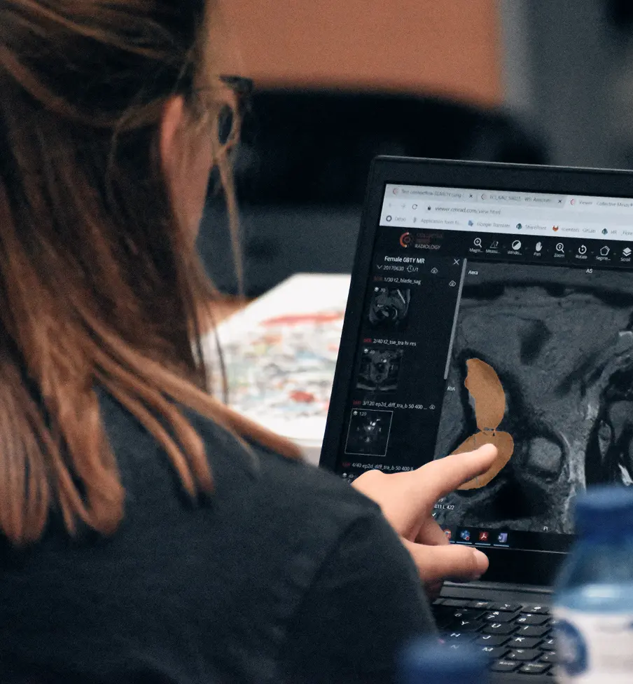
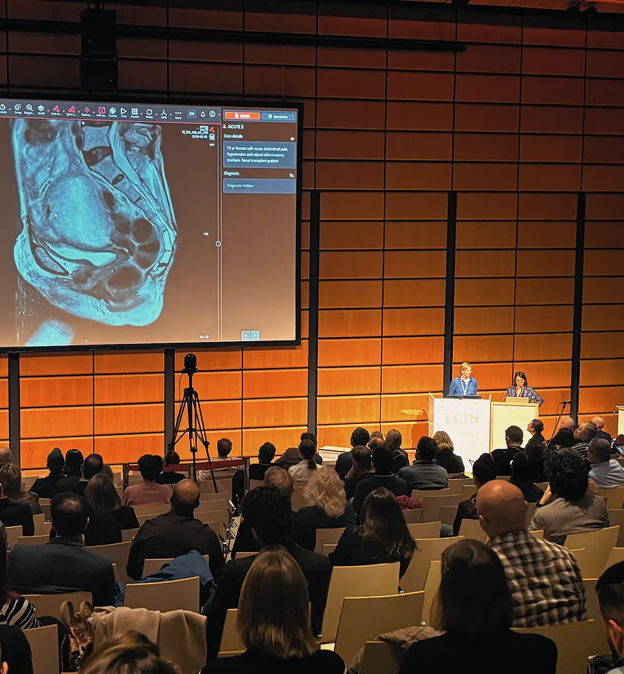
Radiology is DICOM-heavy. You can't teach it on slides, because a slide can't hold a full DICOM study with all its series. The obvious fix, a slide tool that "supports DICOM", was the wrong one.

So I turned it inside out. Instead of dragging DICOM into an education tool, I brought the educational tools inside the DICOM viewer: the same viewer every student will spend their entire career using.
A presenter speaking to a seated audience beside a projection screenA woman reviewing course material on a laptopA full conference audience watching a large presentation screen
A Case Editor With No Authoring Layer
I designed a what-you-see-is-what-you-get case editor where the educator builds a case in the exact state the student will receive it. No separate authoring mode. No save-and-preview loop. No menu diving. You arrange the case the way you want it shown, and the system takes it from there.

The authoring experience and the learning experience are the same surface.
The author and the student look at the same screen. Almost nothing in this field does that.
The Underlying System
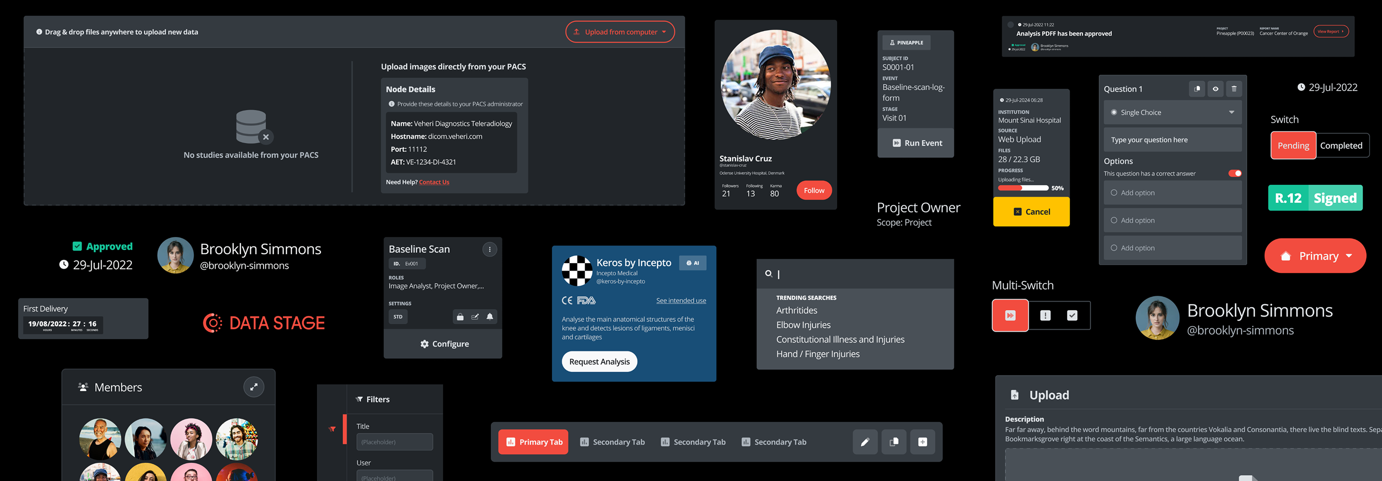
There was no design system when I arrived. I proposed one, built it, and still maintain it today.

It solved a present-tense problem, not a hypothetical one: it let us iterate and test fast, kept every product consistent, and meant new products inherited a coherent language by default instead of by heroics. It's now close to a hundred pages of components, shared across every product and plugged straight into the front-end library.

I worked the library out with engineering directly. They'd propose elements from their own libraries, and we iterated until design and code were genuinely compatible, not just roughly aligned. That gave the front-end team their time back to spend on quality instead of fighting to align things.
A dark design system library showing components, buttons and user avatars
Once the system was in place, the need to build new components dropped by more than 80%.
Building the team
Once CM-Research was stable, I hired a junior designer and brought her through the system, the design language, the interviews, the workflows. When she was ready, I made her primary on CM-Education and stepped back to secondary.
A group photograph of the full company team
Owning Product Decisions
This is the part of the role that grew the most, and the part I care about most. Three moments stand out.
1
I introduced a customer-facing roadmap. Because I'm in constant contact with both users and sales, I sit in a good spot to work with PMs on what gets prioritised. The roadmap generated real excitement in client conversations and directly helped close deals. Design influence showing up as revenue, not just polish.
2
Reading through sales contracts, I noticed universities increasingly required accessibility certification, and none of our competitors had it. I led a WCAG review across every product and took engineering through it until we were compliant. A design observation became something the whole company could sell against.
3
Research never stopped at Sweden. Over the years I've run it with universities across the US and labs in Barcelona, London, and Stockholm. The Sweden embed was the start of how I work, not the whole of it.
Where It Is Now
Five years in, the work is as much product as design. I shape the overall vision across the company's products, work on brand alongside marketing, and ship with engineering and customer success. The title moved from Junior to Senior Product Designer. The real change was from executing a product to helping decide what the products should be.

What the regulated world taught me that nothing else could: detail isn't only something you hold yourself to. It's something a third party has to be able to verify. That standard now turns up in everything I make.
Listen